Pagar.me
Link.me Payment App
Role
Product Designer and Product Manager
Skills
Product management
UI Design
UX Design
Marketing
Duration
3 months
Tools
Figma
Figjam
Hotjar
Metabase
Context
Link.me helps retailers receive payments remotely via links sent to customers, allowing them to pay however they like. This app was intended as the entryway for all of Pagar.me's product portfolio.
Problem
During the pandemic, Link.me faced rapid growth and struggled to scale. Small brick-and-mortar businesses were forced to go digital, and the app's strategy began to slip as features competed for attention and performance issues increased. Our challenge was to evolve the service for the influx of new customers, address their pain points, and improve activation and churn rates.
Approach
Understand context: We started with stakeholder meetings to understand goals and existing materials. We created a service blueprint to map the app’s behavior.
Research
To understand the product vision, I interviewed stakeholders from various teams and mapped the app's structure and architecture. We conducted both qualitative and quantitative research to identify user pain points and needs.
Qualitative: Interviewed 5 users who had been using the app for at least three months and analyzed competitors.
Quantitative: Created a funnel to understand activation drop-off points and made database queries to identify patterns and problem size.
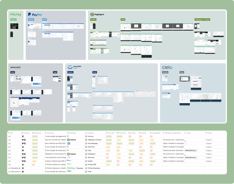
Competitor analysis: Analyzed flows from other players to understand their solutions and features.
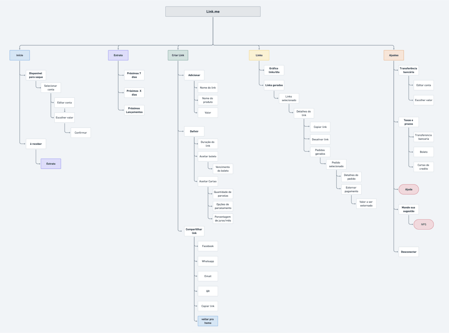
Sitemap: Mapped the current app flow to understand its architecture and flows.
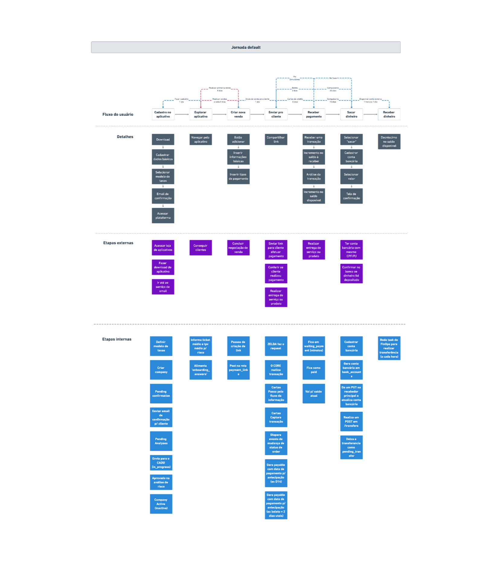
Service blueprint: Mapped the journey of agents and tenant prospects, and analyzed the product's main behaviors to identify problems.
Solutions
With the gathered information, PM, Design, and Engineering collaborated to create hypotheses and select solutions.
Sales Profile
Hypothesis: Small businesses were churning because they didn't have separate profiles for employees.
We proposed a 'seller profile', creating access blocks during the user's flow to prevent viewing and performing confidential operations.
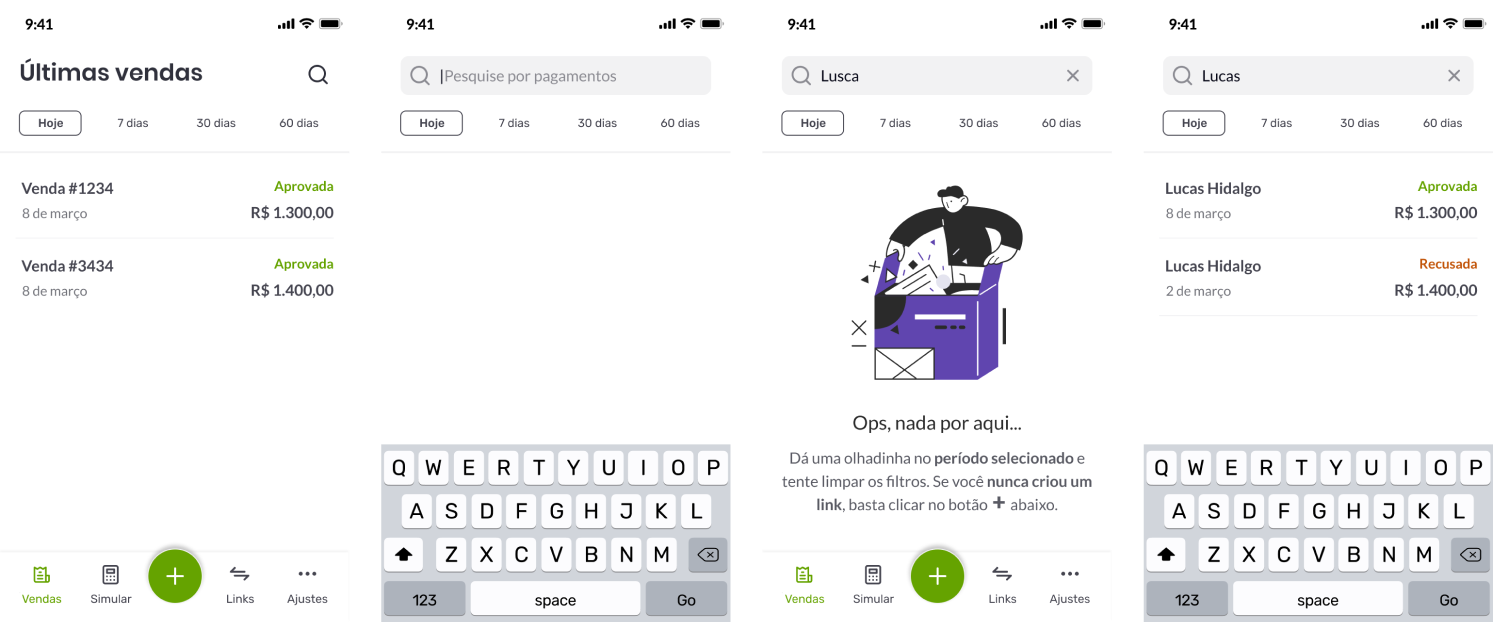
Sales Section
Hypothesis: Users had difficulty viewing payments because everything was grouped by payment links.
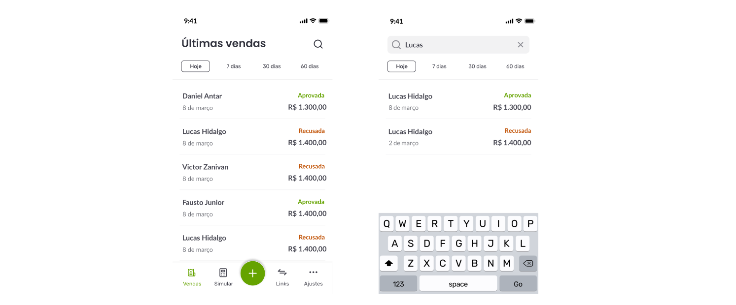
We created a section where all payments are listed in chronological order.
Web Platform Access
Hypothesis: Users struggled to create monthly reports because we only offered a mobile platform.
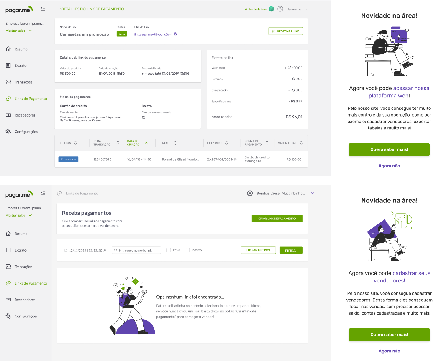
We provided personalized access for Link.me users on the Pagar.me dashboard, where they could access their operations and export CSVs.
Results
We achieved several OKRs with the proposed solutions:
- Reduced churn
- Improved NPS (health metric)
- Active base and activation percentage decreased
Although we had hypotheses about the decrease in active base and activation, Pagar.me's holding company, Stone.co, decided that the Stone account app should be the main solution for small businesses, ending Link.me’s journey.
Let's get in touch!
Feel free to reach out, I'm always up for a good chat :)
© Victor Zanivan 2026